
Brand Identity • Logo Design • Youth Ministry Brand • Kids Ministry Brand • Web Design (Webflow)
Trinity Church
Client
Contact
Industry
Location
Year Completed
Affiliation
About Trinity Church
Trinity Church is a Bible-teaching church in Scottsdale, Arizona, running services across six time slots every weekend and ministering to thousands of members through a full ecosystem of programs. Real Men. Real Women. Students. Young Adults. Kids. Life Groups. It is not a small congregation with a simple website problem. Trinity came to us for nonprofit web design and a complete brand identity overhaul in 2024, and the scope made that clear from the first conversation.
What Was Missing
A church this size runs on generosity and volunteers. Without both, nothing else works. The old website was making both harder than they needed to be.
Giving was buried. Not gone, but not front and center the way it needed to be for a congregation that runs on donations. If someone arrived at the site ready to give and had to hunt for the button, some of them just didn’t.
Volunteering had no clear entry point. Trinity had a robust serve program with real opportunities for people to get involved. None of that was surfaced in a way that made saying yes feel easy.
And the ministries — all six of them — were somewhere on the site, but not organized in a way that helped a first-time visitor figure out where they belonged. A 20-year-old and a dad of three are both looking for community at Trinity Church. They need different front doors.
The brand had the same structural problem. One logo, no system. Nothing that could extend into a kids ministry or a youth program and still feel like Trinity Church. The identity hadn’t kept pace with how much the organization had grown.
The Strategic Direction
A church website is not a brochure. It is infrastructure.
People show up on it for three reasons: to give, to find where they fit, and to decide whether they are actually going to come on Sunday. If any of those paths require effort, some percentage of people will not complete them. For a church, that is a real cost with no clean way to measure it.
So the priority hierarchy had to be settled before any visual decisions were made.
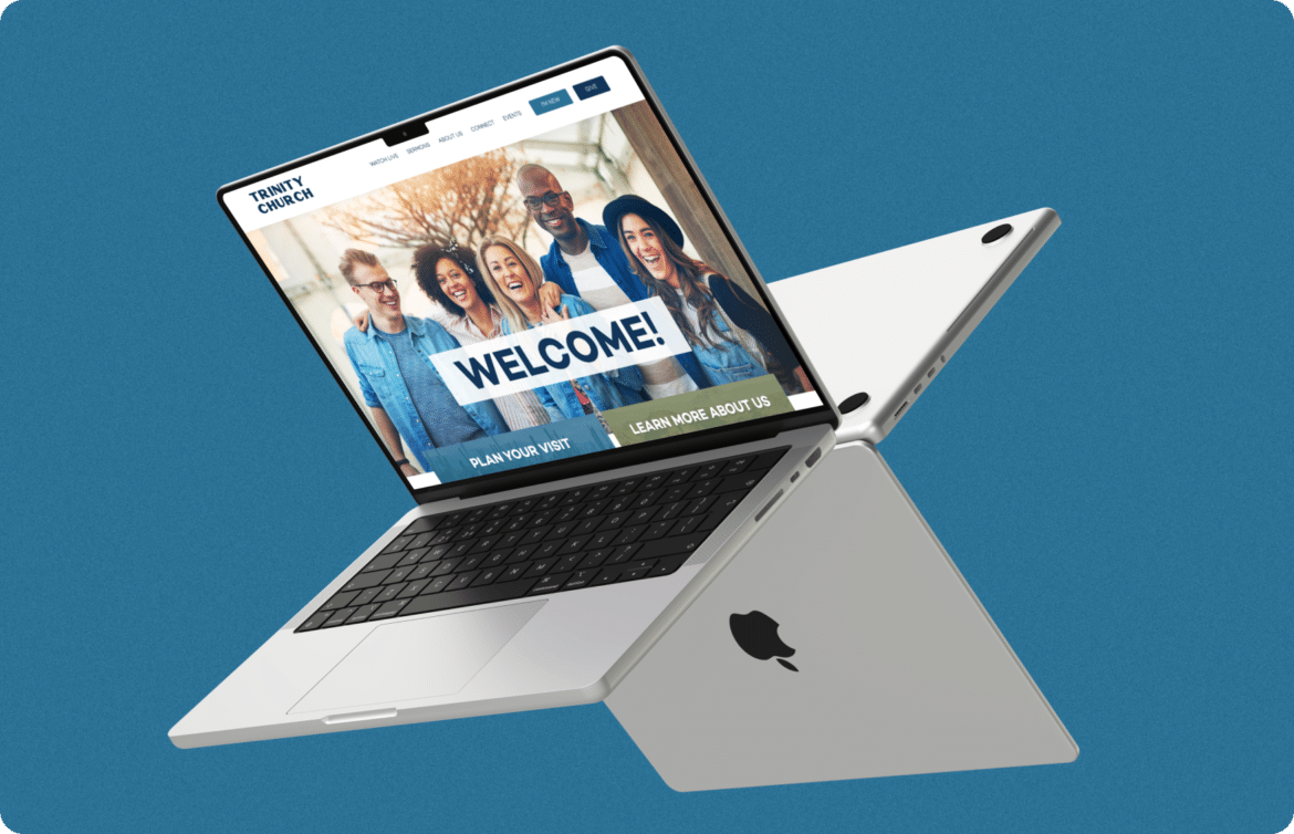
Give goes at the top. Not competing with navigation. Not tucked in a footer. First, visible, and unmissable because the people ready to give should never have to look for the button.
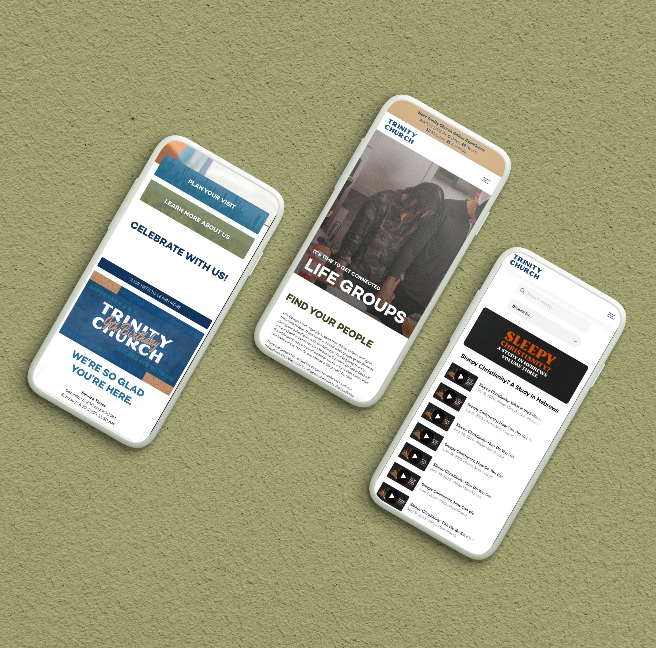
Serve gets its own dedicated path. Volunteer recruitment is one of the highest-value outcomes a nonprofit website can drive. The page existed. The friction was the problem. Reducing that friction was non-negotiable.
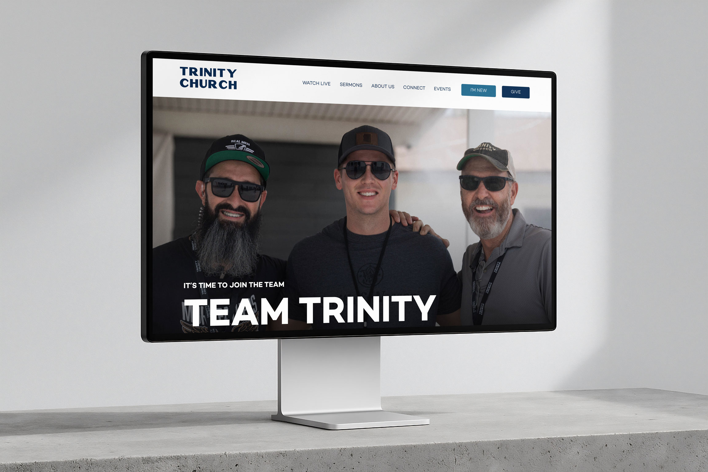
The ministries needed organization that matched how people actually think about them. Real Men, Real Women, Students, Young Adults, Kids, and Life Groups are not the same audience arriving with the same question. The site structure had to make it fast for each person to find their community without wading through content meant for someone else.
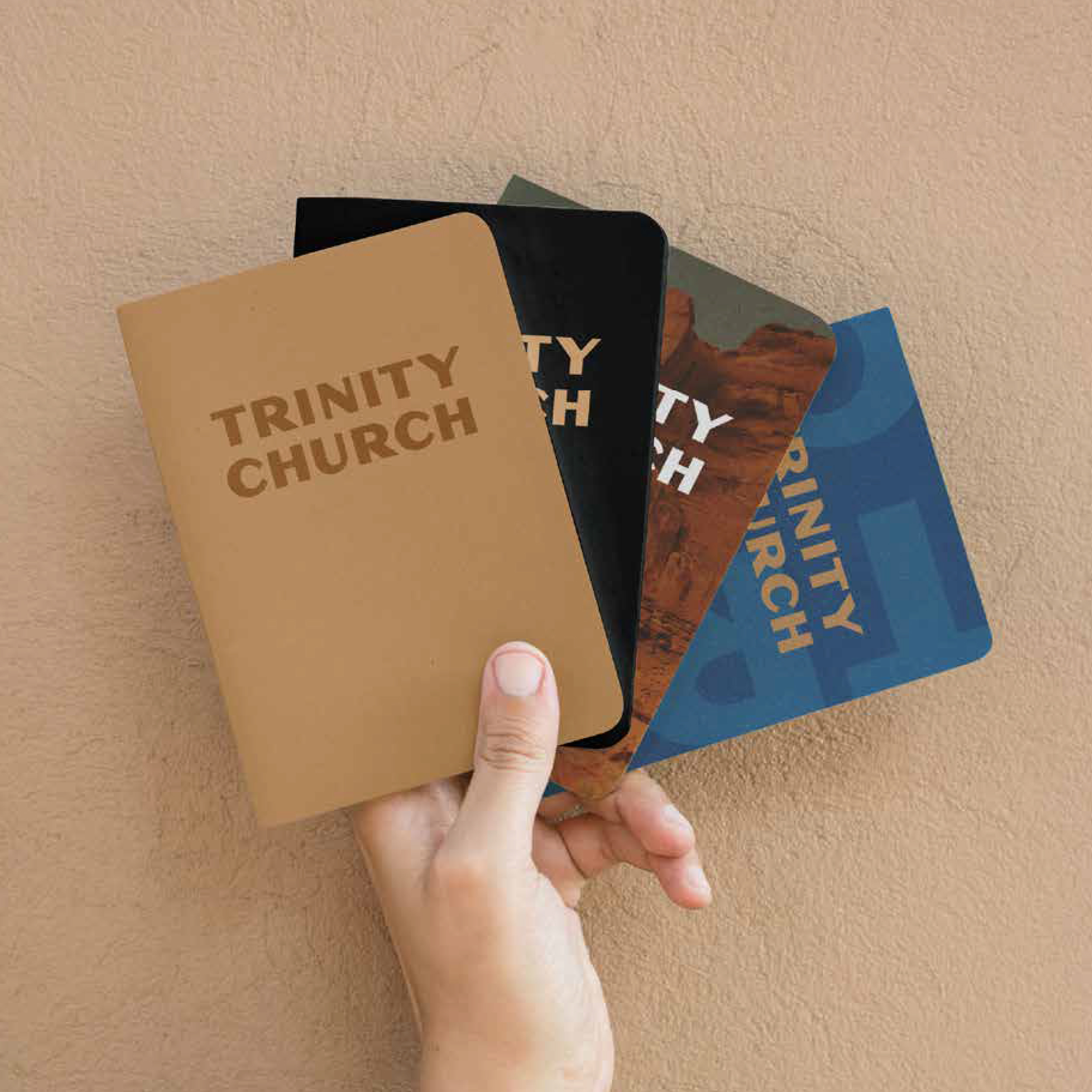
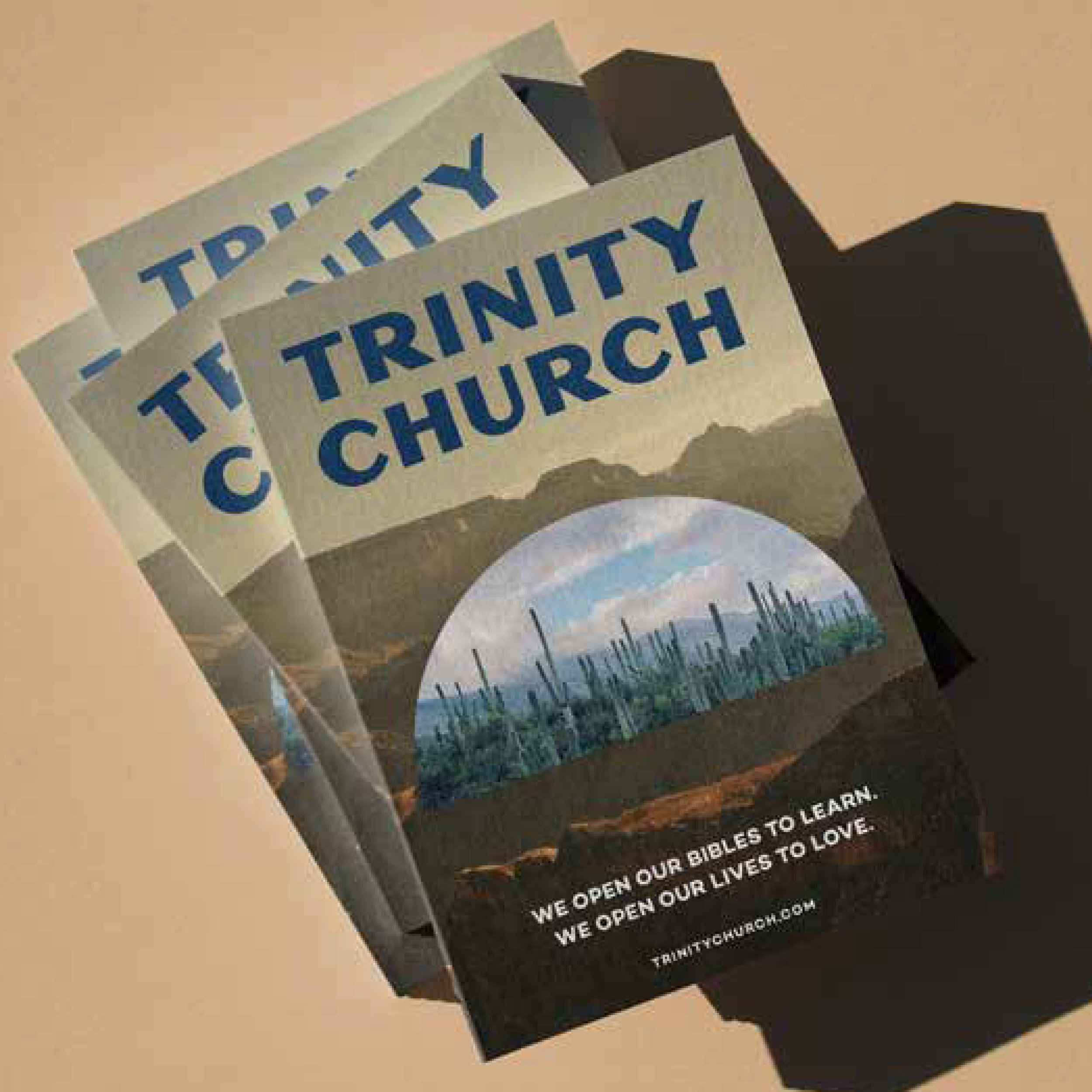
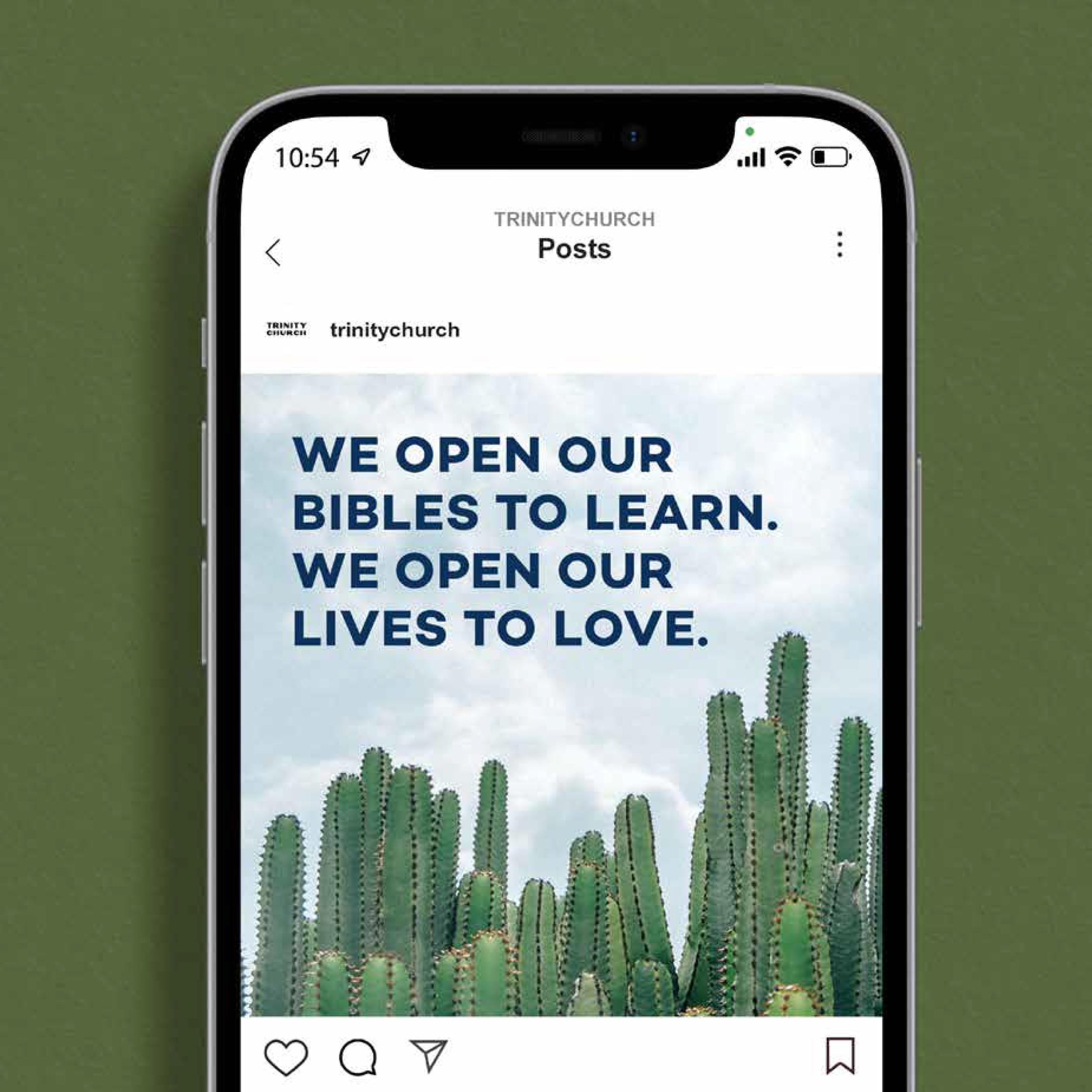
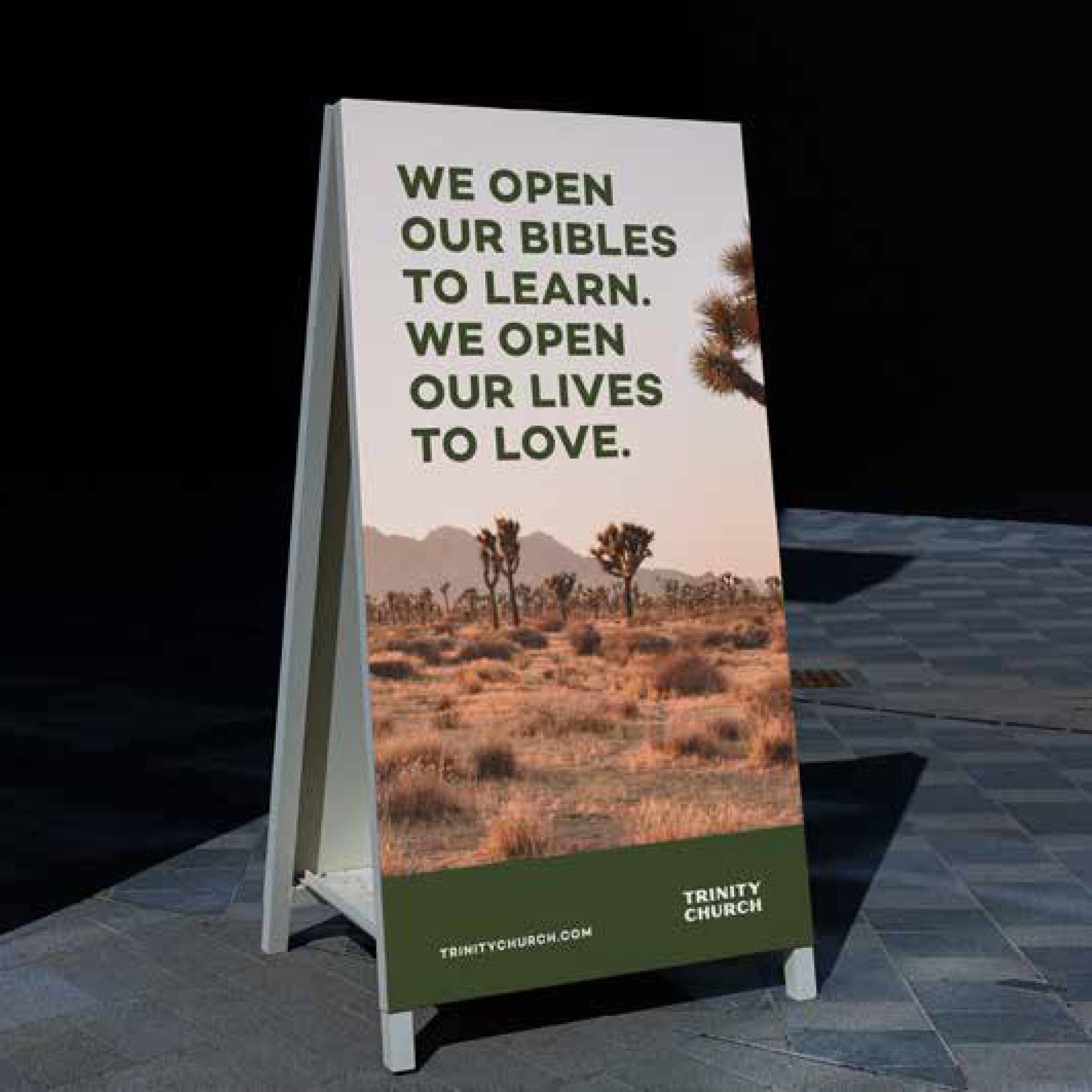
That navigation logic shaped everything about the visual work. Trinity needed a brand system, not just a logo refresh. The primary identity had to anchor the whole organization. From there, two sub-brands: one for the youth ministry, one for the kids program. Each one distinct enough to have its own visual personality. Both unmistakably Trinity Church.
Type, color, and mark systems were built to travel. Screen, print, social. A church this active produces a constant volume of visual content. The system had to be flexible enough that the team could use it without a designer in the room every time.
The goal: a visual identity and a website that made giving, serving, and finding your ministry the three easiest things to do on the page.
The Work

A Brand That Finally Matched the Organization
Trinity Church launched in 2024 with a brand system built to cover the full scope of what they do. Three identities. One visual language. A site structure designed around the actions that matter most.
After launch, the church saw a measurable uptick in volunteer sign-ups and online viewership. Both are direct results of what the site was designed to accomplish. Give is easier to find. Serve has a front door. The people looking for community can find the right ministry without guessing.
That is what nonprofit web design is supposed to do. Not just look good at launch, but function well enough to move people to action after it.
Want results like this?
More Work
READY TO BUILD A BRAND THAT DOES THE REAL WORK?
I take on a limited number of projects at a time so every client gets my full attention. If you're ready to stop blending in, let's talk.