
Brand Identity • Web Design • UI/UX Design
Caper
Client
Contact
Industry
Location
Year Completed
Affiliation
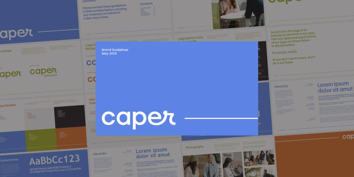
About Caper Associates
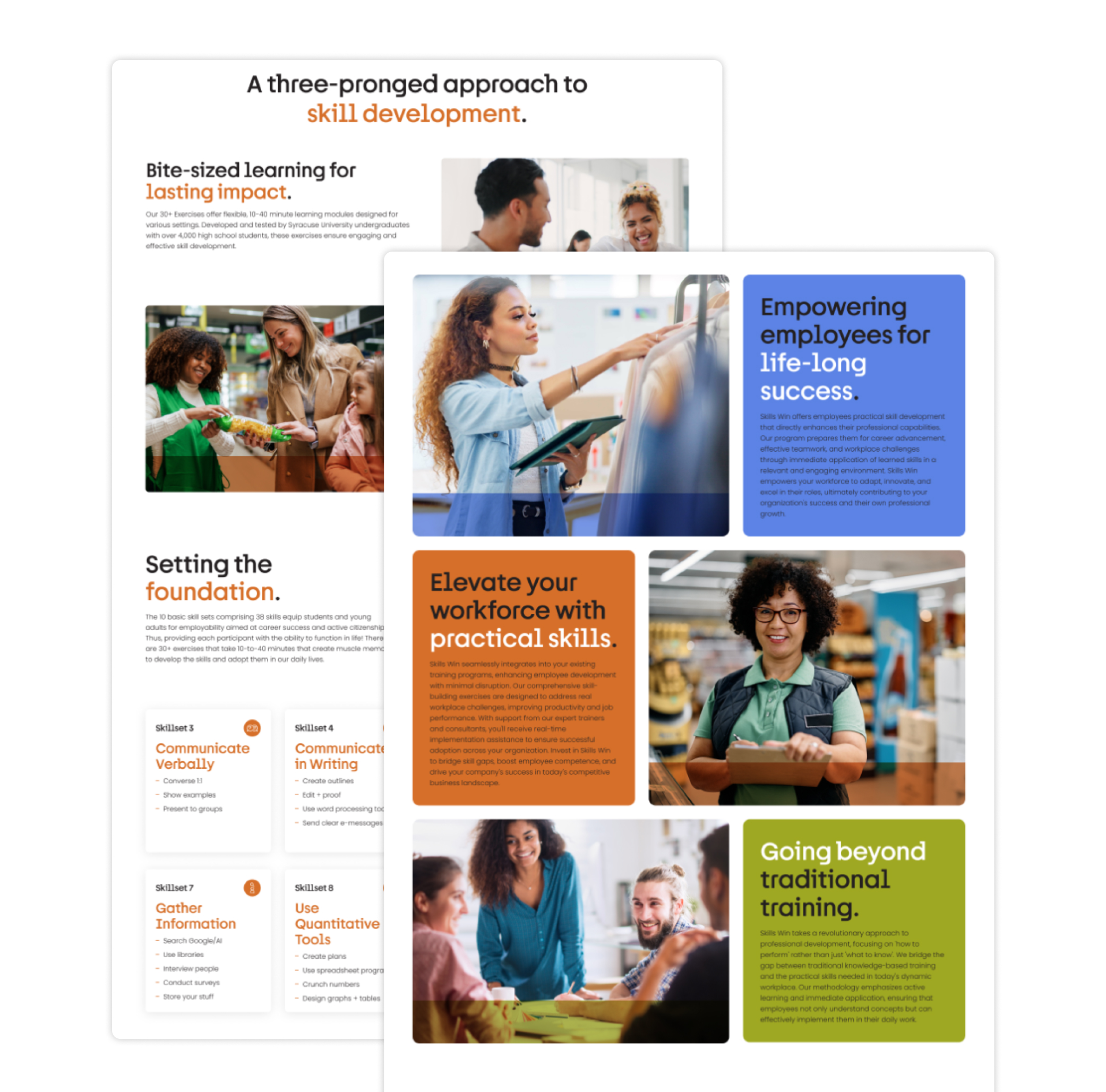
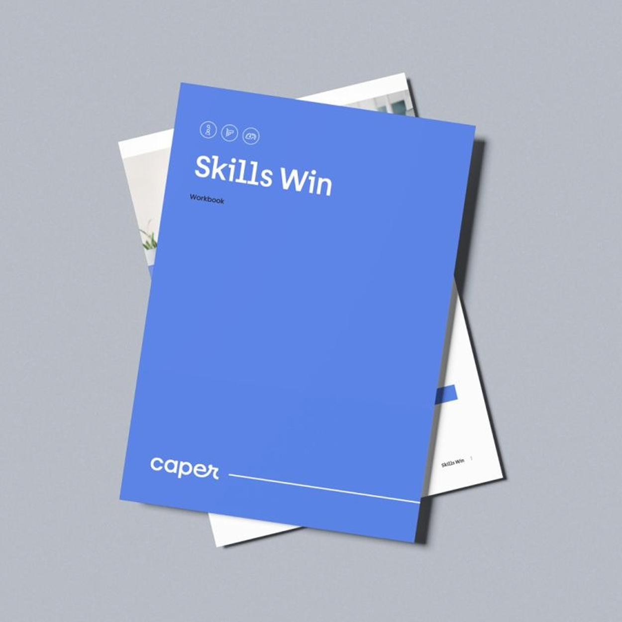
When Rebecca Edelman came to me for startup brand identity design, Caper Associates didn’t exist yet beyond a name and a mission. She’s the founder and CEO of a Connecticut-based edtech company built around one urgent premise: the gap between what schools teach and what the workforce actually demands is widening, and someone has to close it. Caper’s program, Skills Win, puts practical skills into the hands of students 14 and up — communication, time management, project management, critical thinking — delivered across educational institutions and professional settings nationwide.

The Challenge
A brand-new company has no visual anchor. No logo. No color palette. No established voice. Nothing to hand a designer and say “keep going in this direction.” That’s freeing in some ways, and genuinely hard in others.
The challenge with Caper wasn’t just that they needed a brand. It was that the brand had to do a specific job on day one. Rebecca was about to introduce Caper to school administrators, educators, and employers — audiences who need to trust a program before they’ll bring it into their classrooms or their organizations. The identity had to communicate credibility and playfulness at the same time.
Too corporate, and it wouldn’t land with the students who’d actually be using it. Too casual, and it wouldn’t earn the confidence of the decision-makers holding the budget.
That’s a narrow lane to design in.
Why Startup Brand Identity Design Starts With the Name
Most startup brand identity design projects start with a mood board, a competitor audit, or a request to “make it feel modern.” I start with the name.
With Caper, the name said everything.
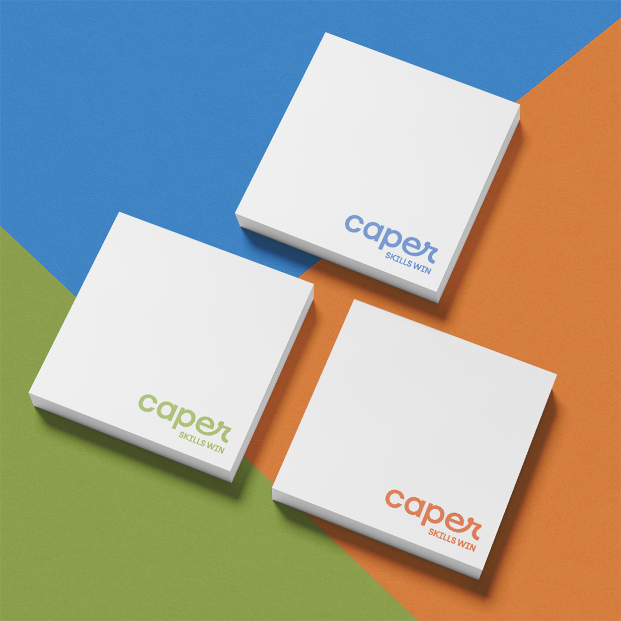
As a noun, a caper is a fun detail, an unexpected element — something that adds surprise to whatever it touches. As a verb, it means to skip, jump, or leap about in a frolicsome, joyful way. To caper. There’s movement in it. There’s lightness. There’s the specific kind of joy that comes from doing something with your whole self and not overthinking it.
That pointed the entire direction.
An edtech company teaching workforce skills doesn’t have to feel like a compliance training module. It can feel like something students actually want to show up for. Caper had a chance to build a brand that stood apart from the sea of serious, corporate skills programs precisely because it was willing to lean into the word at the center of everything.
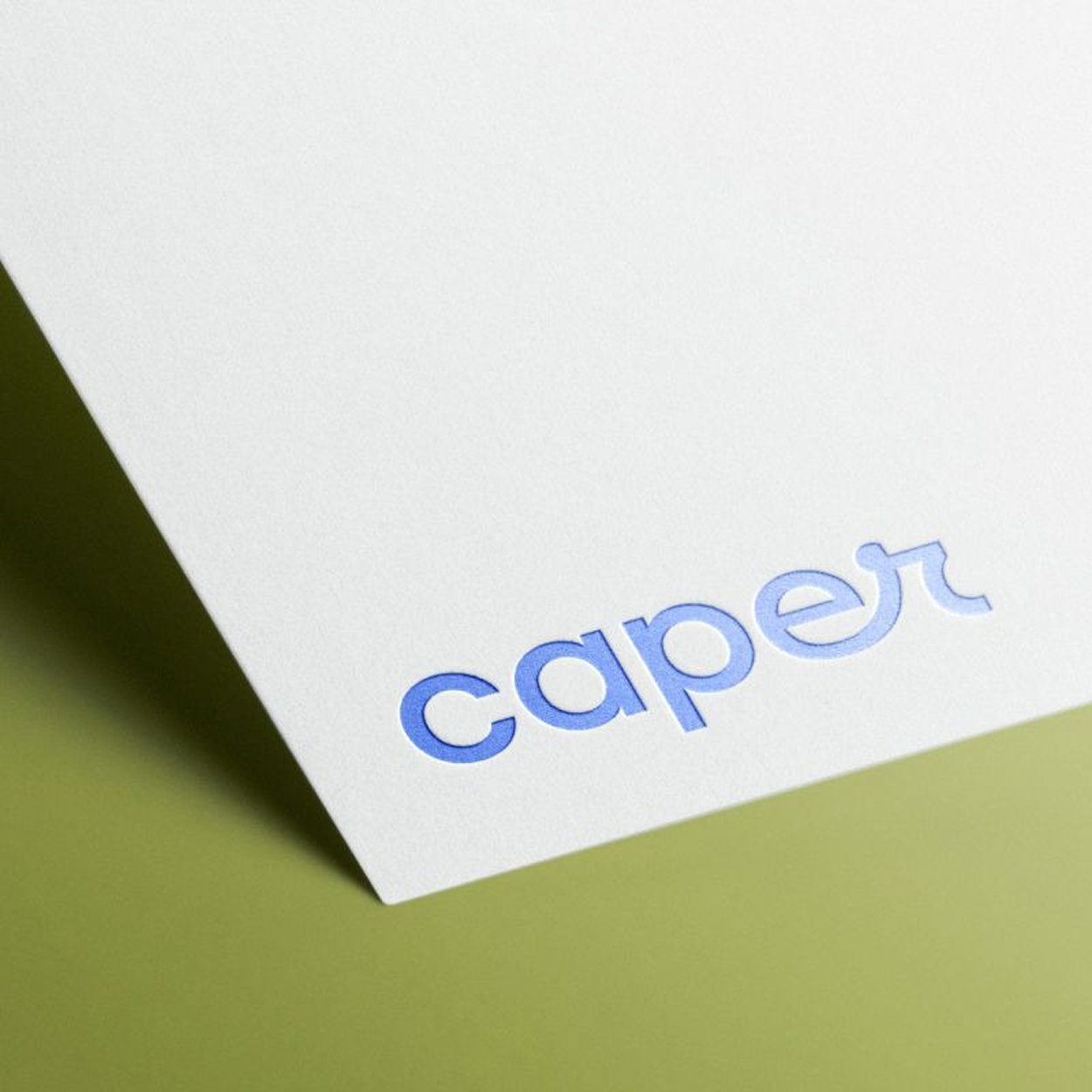
The logo came directly from that insight. The letterforms are connected and flowing, built to suggest movement. There’s a playfulness in how the letters relate to each other that you feel before you can name it — which is exactly where a logo should live. A program working with 14-year-olds cannot look like it belongs in a boardroom. It has to earn the trust of the adults without boring the students, and the brand has to hold that tension without breaking.
The WordPress site extended the same logic — a clear path for educators and employers to find what they need, with warmth and energy threaded throughout.
I’ve sat across from enough founders to know that the ones who commit to the meaning of their name rather than running from it end up with brands that hold. Rebecca committed. That made everything else easier.
The goal throughout: startup brand identity design that could walk into a school district or a corporate HR office and belong in both rooms.
The Work


A Brand Worth Building On
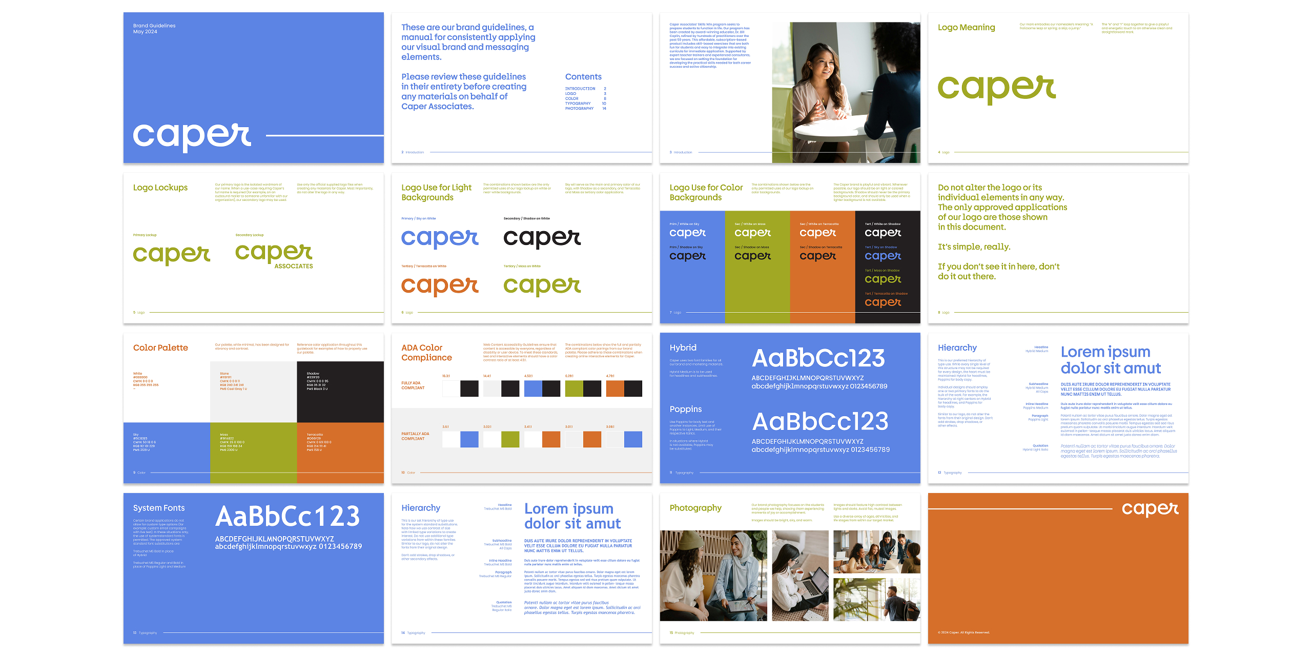
Caper Associates launched in 2023 with a complete brand identity, a live WordPress site, and a visual system built to grow with the company. What started as startup brand identity design has continued into ongoing UI/UX work as the Caper platform develops — which tells you something about how the relationship went.
Rebecca became more than a client over the course of this project. That’s not something I say about every engagement. But when someone trusts you with the first visual impression of something they’ve spent years building, and you do the work right, the relationship tends to grow. With Rebecca, it did.
Working with Steph has been one of the most transformative and rewarding experiences of my professional journey. She didn’t just help develop the visual identity of Caper—she helped bring the soul of our brand to life. Steph is the rare kind of creative partner who blends extraordinary design skill with a deep, intuitive understanding of your mission. Her attention to detail is astonishing. Her professionalism is unwavering. And her kindness and thoughtfulness shine through in every interaction.
Steph listens carefully, asks the right questions, and then somehow translates complex ideas into clean, compelling, and beautiful design. She helped Caper present ourselves to the world with greater clarity, impact, and heart—on every level, from strategy to design to tone.
She is a visionary designer, an incredibly grounded collaborator, and, simply put, someone you want on your team when the stakes are high and the work really matters.
I can’t recommend her highly enough.
Rebecca Edelman | Founder & CEO, Caper Associates
More Work
READY TO BUILD A BRAND THAT DOES THE REAL WORK?
I take on a limited number of projects at a time so every client gets my full attention. If you're ready to stop blending in, let's talk.