
Brand Identity • Logo Design • Web Design • Social Media
PrismJet
Client
Contact
Industry
Location
Year Completed
Affiliation
About PrismJet
PrismJet is a Scottsdale-based private jet charter and aircraft management company founded by a team with over 100 years of combined aviation experience. CEO Mike Bianco and his principals built PrismJet around a gap they kept seeing in the industry: too many management companies, not enough that actually put the client first. Their customers are jet owners and charter clients who want concierge-level service without the corporate runaround. The kind of operation that handles every detail so you can focus on where you’re going, not how you’re getting there.
What Was Missing
Luxury aviation is a visually crowded space. Most brands reach for the same playbook: deep navy, gold accents, a jet silhouette, a tagline about excellence. Safe. Expected. Invisible to the exact audience these companies are trying to reach.
PrismJet was launching into that market with a genuinely differentiated service model. Serious aviation experience. A client-first approach that most competitors weren’t delivering. What they didn’t have was a brand that communicated any of that at a glance.
Without a distinct visual identity, a company built on expertise and trust looks like every other charter operation in a Google search. The brand had to do what the name and the team already did: signal something different.
The Strategic Direction
The instinct in luxury branding is to reach for the expected signals. Gold. Navy. Serif type. The aircraft itself as the hero image. These choices communicate “premium” in the most generic way possible, which is to say, they don’t communicate anything about the specific company at all.
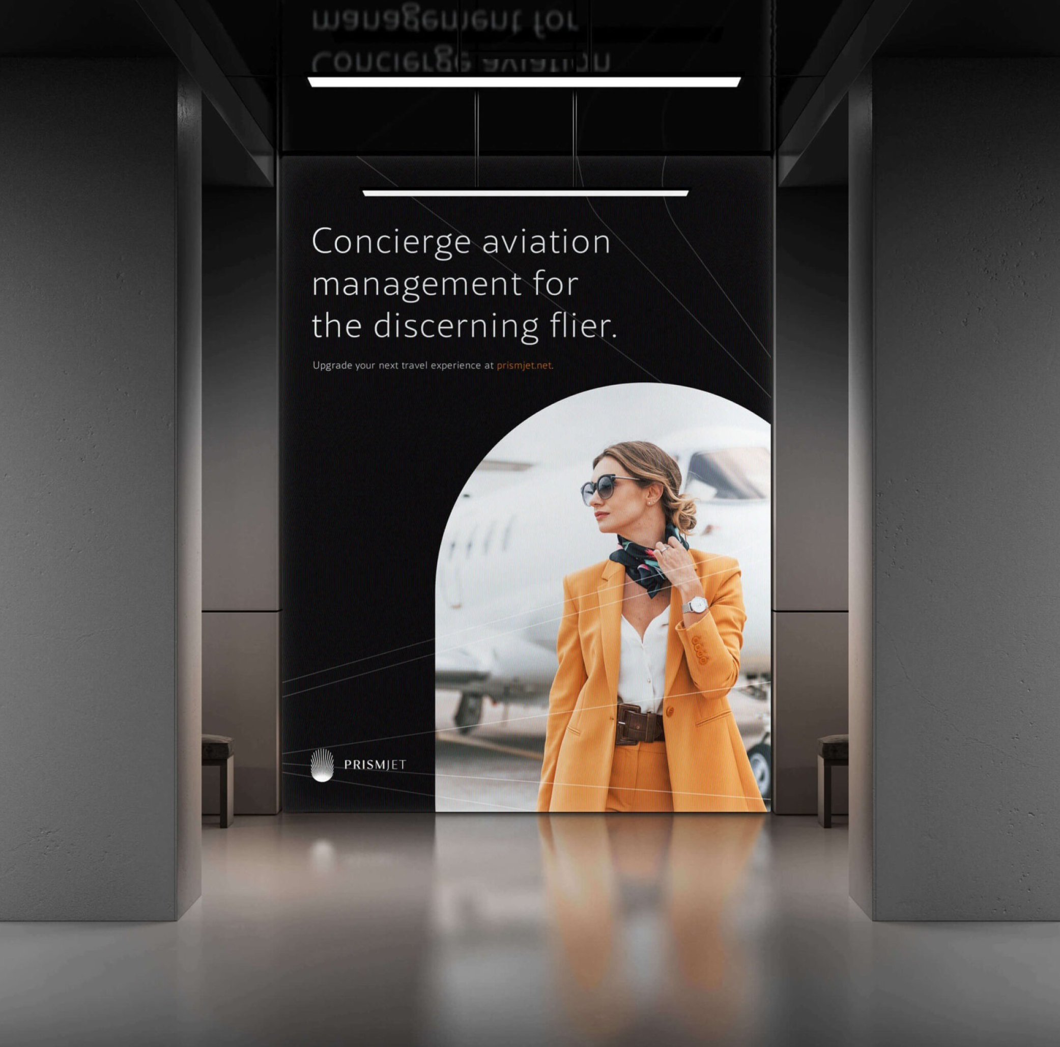
The brief pointed in a different direction from the start. PrismJet’s real value proposition isn’t the plane. The plane is just how you get there. What the company actually sells is the experience of private flight: the freedom, the calm, the expansive view from 30,000 feet with none of the friction of commercial travel.
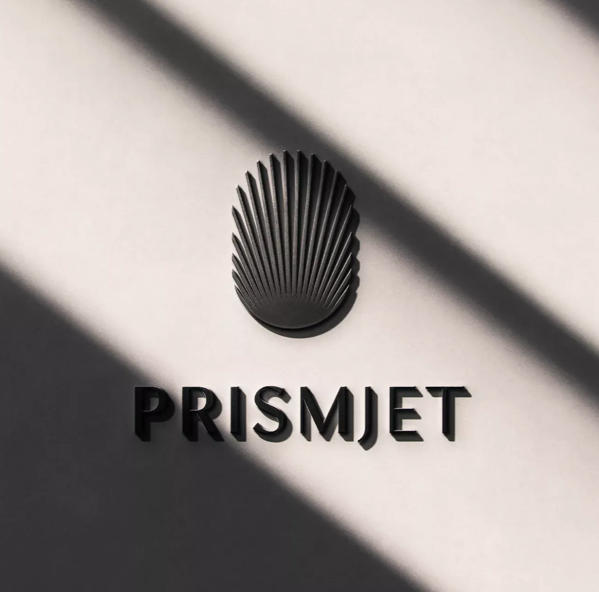
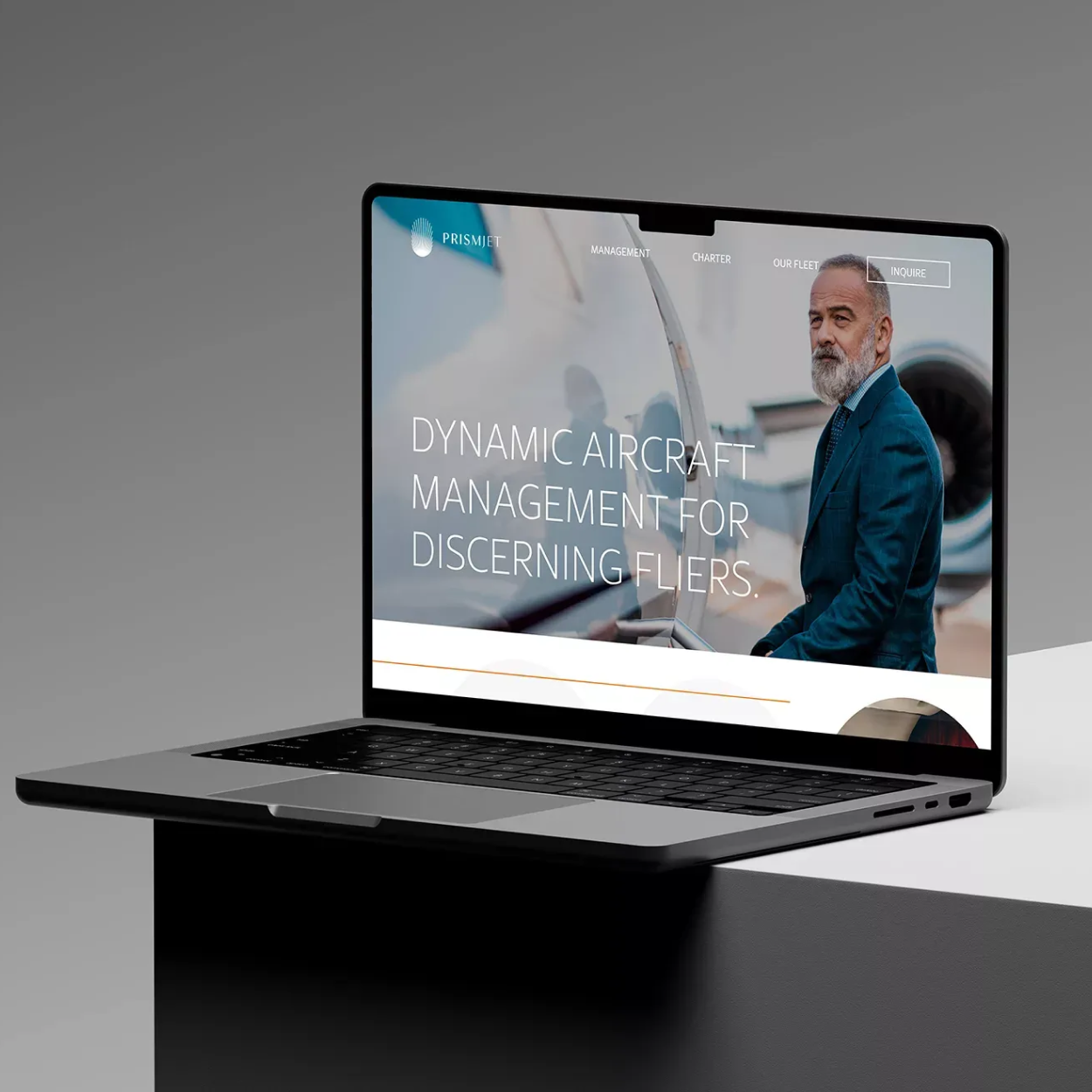
That insight drove the logo concept directly. The mark evokes the view out a private plane window, referencing a moment that every private flier knows instantly and every first-timer imagines. The window becomes a frame. The experience becomes the visual centerpiece, not the aircraft.
From there, the palette made itself clear. Black and white. Not because it’s minimal for the sake of it, but because restraint does something specific here. A complex color palette draws attention to the brand itself. A clean black and white palette gets out of the way and puts the focus on the lifestyle and freedom PrismJet’s customers are actually buying. It keeps the brand crisp and uncluttered in a category where most competitors are fighting for visual attention with color and pattern.
The result is a brand that reads immediately as luxury without shouting it. One that works on a business card, a jet tail, a website header, and a social profile without losing its clarity. The goal: give PrismJet a visual identity that could hold its own next to the biggest names in private aviation and make the right audience feel, before they read a word, that this company understands them.
The Work
A Brand That Could Carry the Company
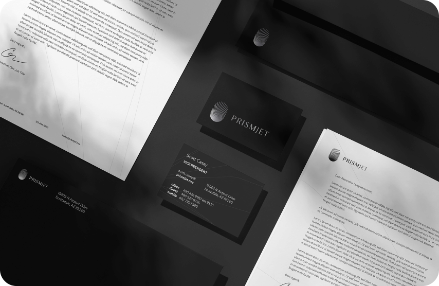
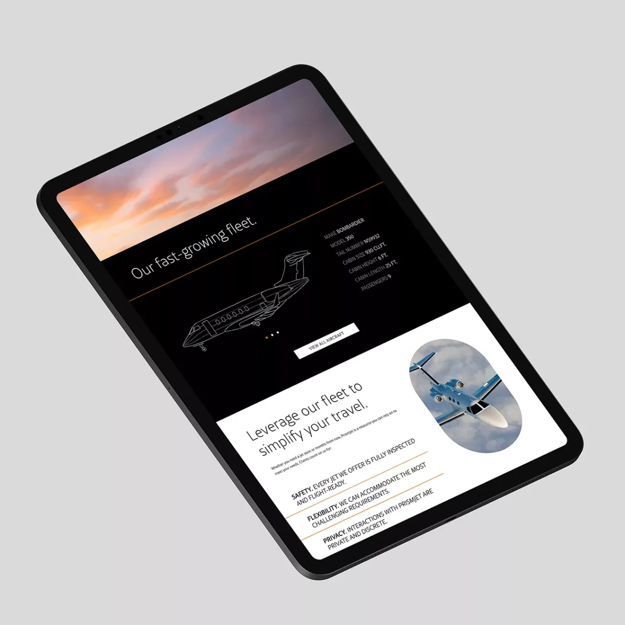
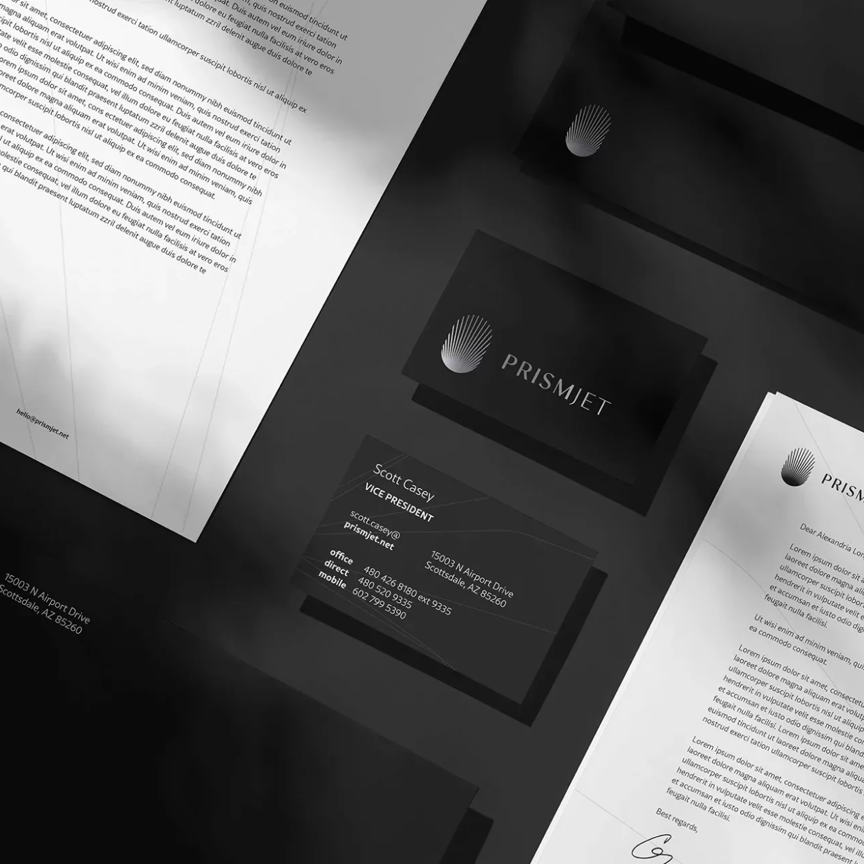
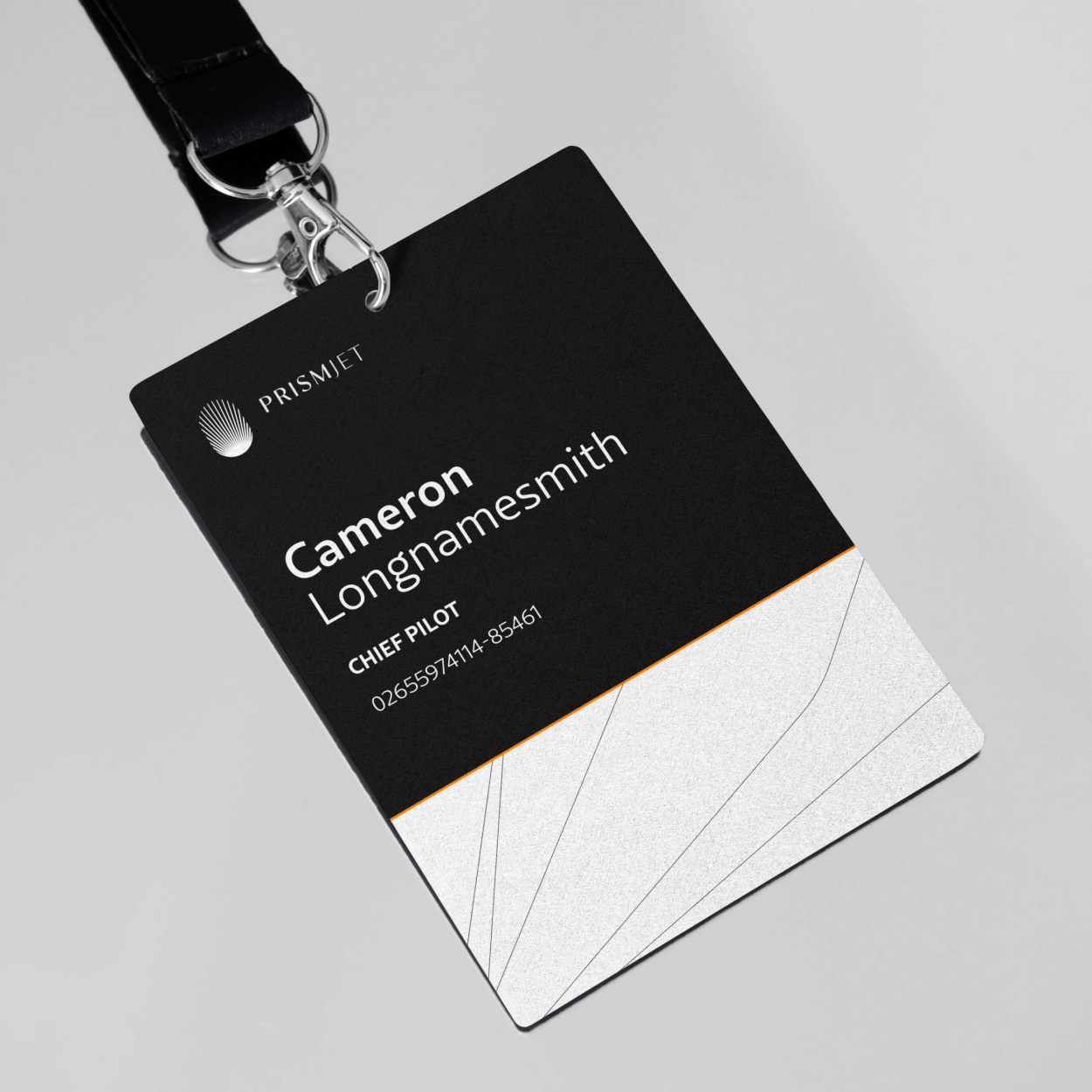
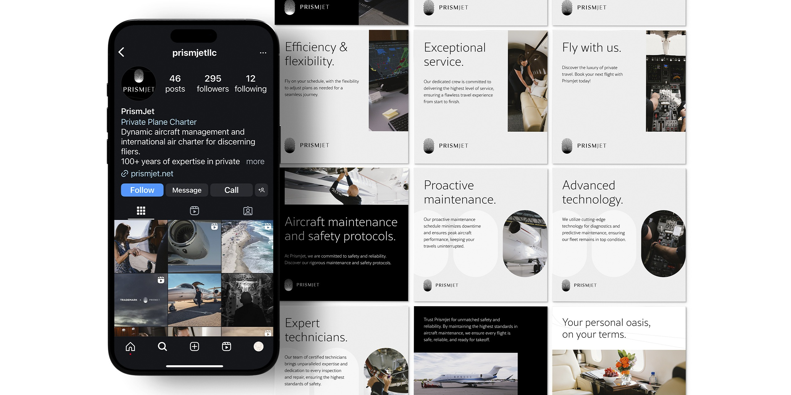
PrismJet launched in 2023 with a brand identity built to sit comfortably alongside the biggest names in private aviation. The black and white system applied cleanly across every deliverable: logo, website, and social.
PrismJet launched in 2023 with a brand identity that could hold its own in one of the most visually competitive luxury markets there is. That was the bar from the beginning, and the black and white system cleared it.
What I watched happen with this project was a company step into the market looking like they had always been there. No visual growing pains. No brand that felt like a placeholder while they figured out who they were. The identity launched tight, and it stayed tight across every touchpoint from day one.
The logo held at scale on the website and collapsed cleanly at small sizes on social. The palette kept the focus exactly where it needed to be: on the experience of flying with PrismJet, not on the brand itself. That restraint is harder to execute than it looks, and it pays off every time someone lands on the site or the Instagram profile and immediately understands what kind of company this is.
Since launch, PrismJet has grown into partnerships with the WM Phoenix Open and the Arizona Diamondbacks. That kind of visibility requires a brand that can show up next to major sponsors and not look like it was built on a budget. This one does.
More Work
READY TO BUILD A BRAND THAT DOES THE REAL WORK?
I take on a limited number of projects at a time so every client gets my full attention. If you're ready to stop blending in, let's talk.