
Brand Identity • Logo Design • Packaging Design
Sugar Rush
Client
Contact
Industry
Location
Year Completed
Affiliation

About Sugar Rush
Sugar Rush is an Arizona bakery built on something most brands only claim to have: a real story. Owner Michelle Kirkland inherited more than a recipe collection.
A cherished bakery passed down through generations. The kind of place where regulars know the hours by heart and the desserts taste like they were made by someone who actually cares. Because they were.

The Problem with "Good Enough"
The business had the story. The loyal customers. The product that speaks for itself. What it didn’t have was a brand identity that could say any of that at a glance.
When Michelle came to me, Sugar Rush was running on a name and a reputation. Nothing visual to match the warmth of walking through the door. Nothing that told a stranger on the street what made this bakery worth choosing over the one down the road. For a business built on nostalgia and joy, that gap was costing them more than they realized.
Why Retro Was the Right Call
The temptation with a bakery brand is to go soft. Pastels, script fonts, a cupcake illustration. Safe. Forgettable. Invisible. Sugar Rush deserved better than the default.
During my discovery session with Michelle, two things became clear quickly. The generational story wasn’t a supporting detail. It was the brand. The 1970s aesthetic, with its bold shapes and hand-drawn warmth, was exactly right.
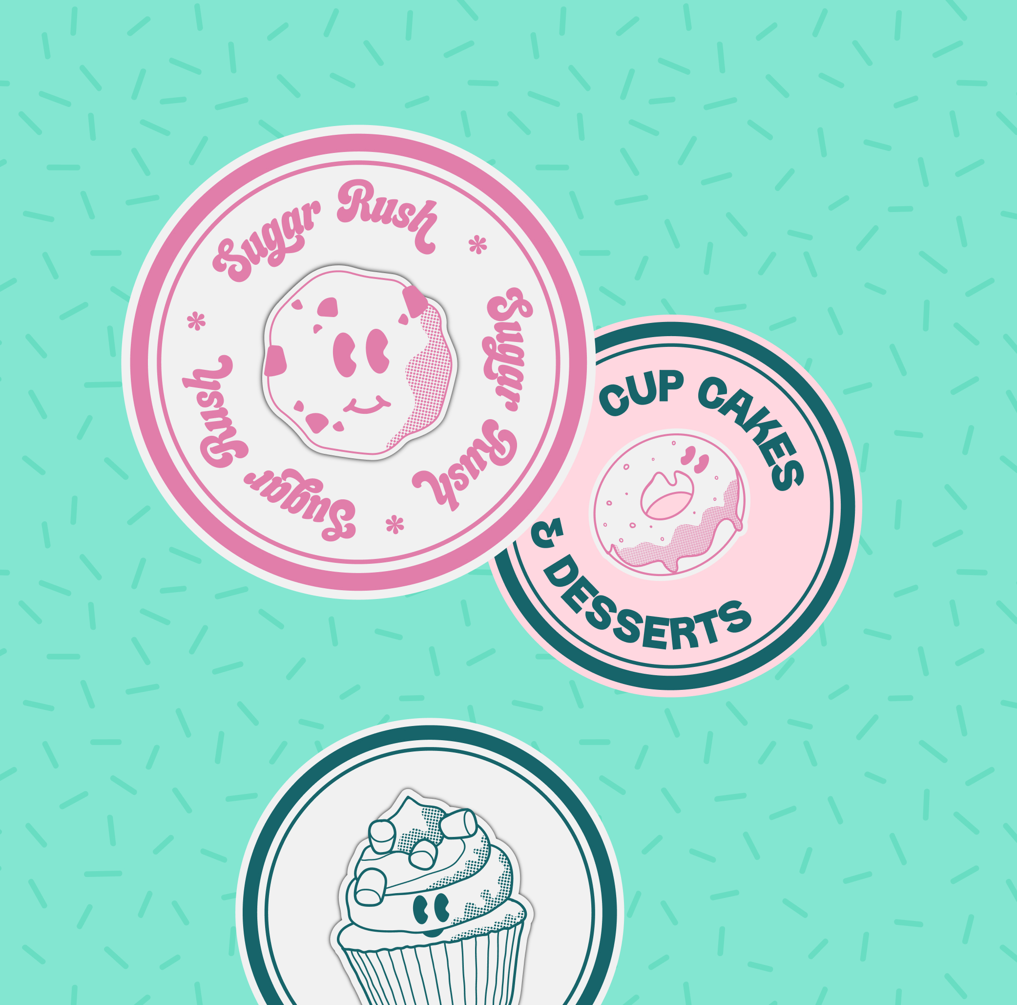
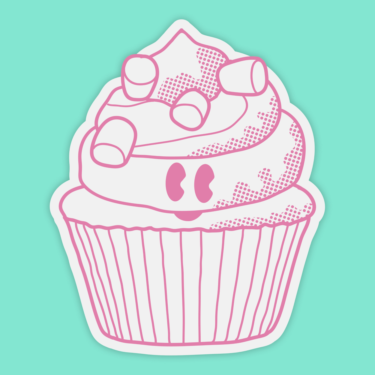
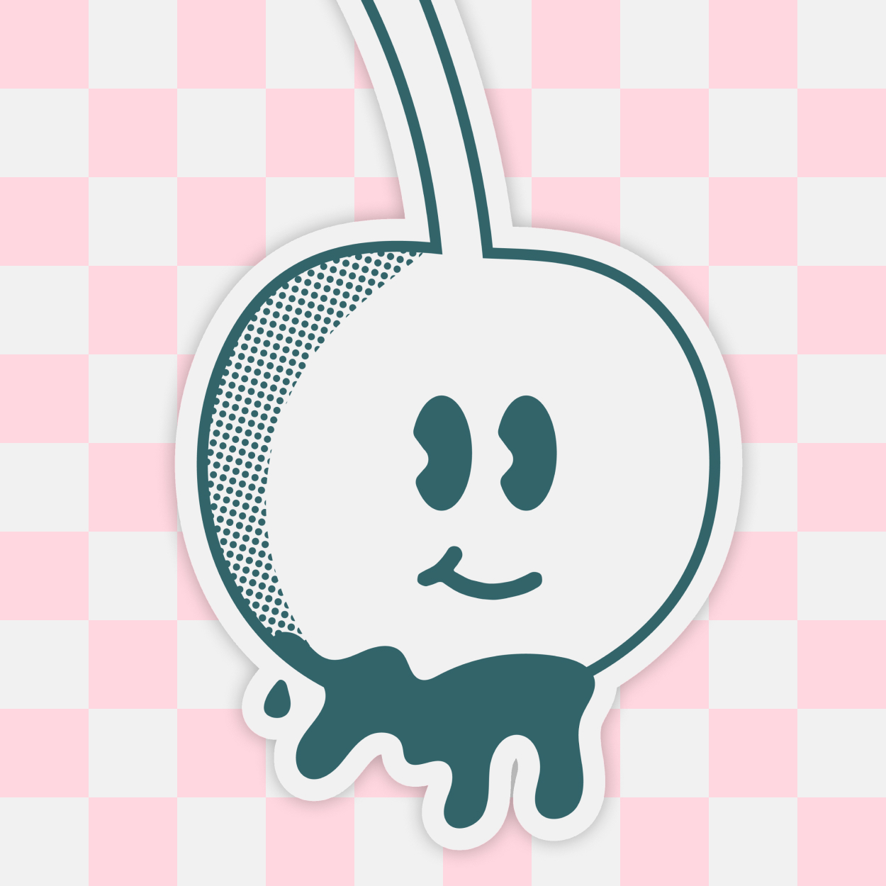
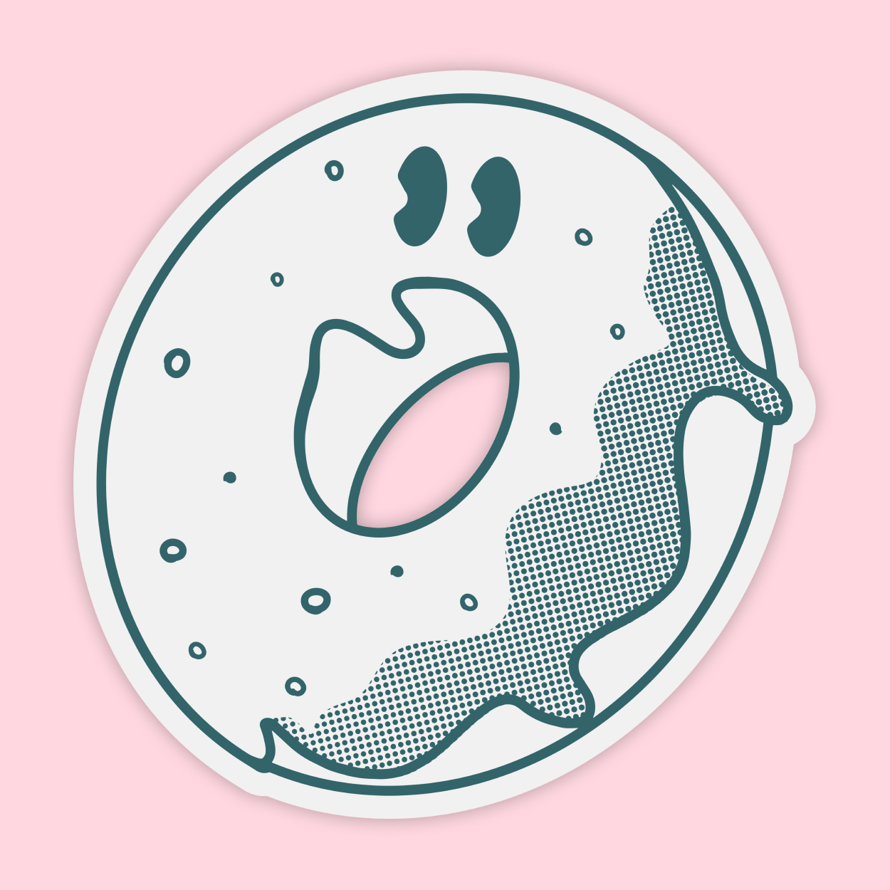
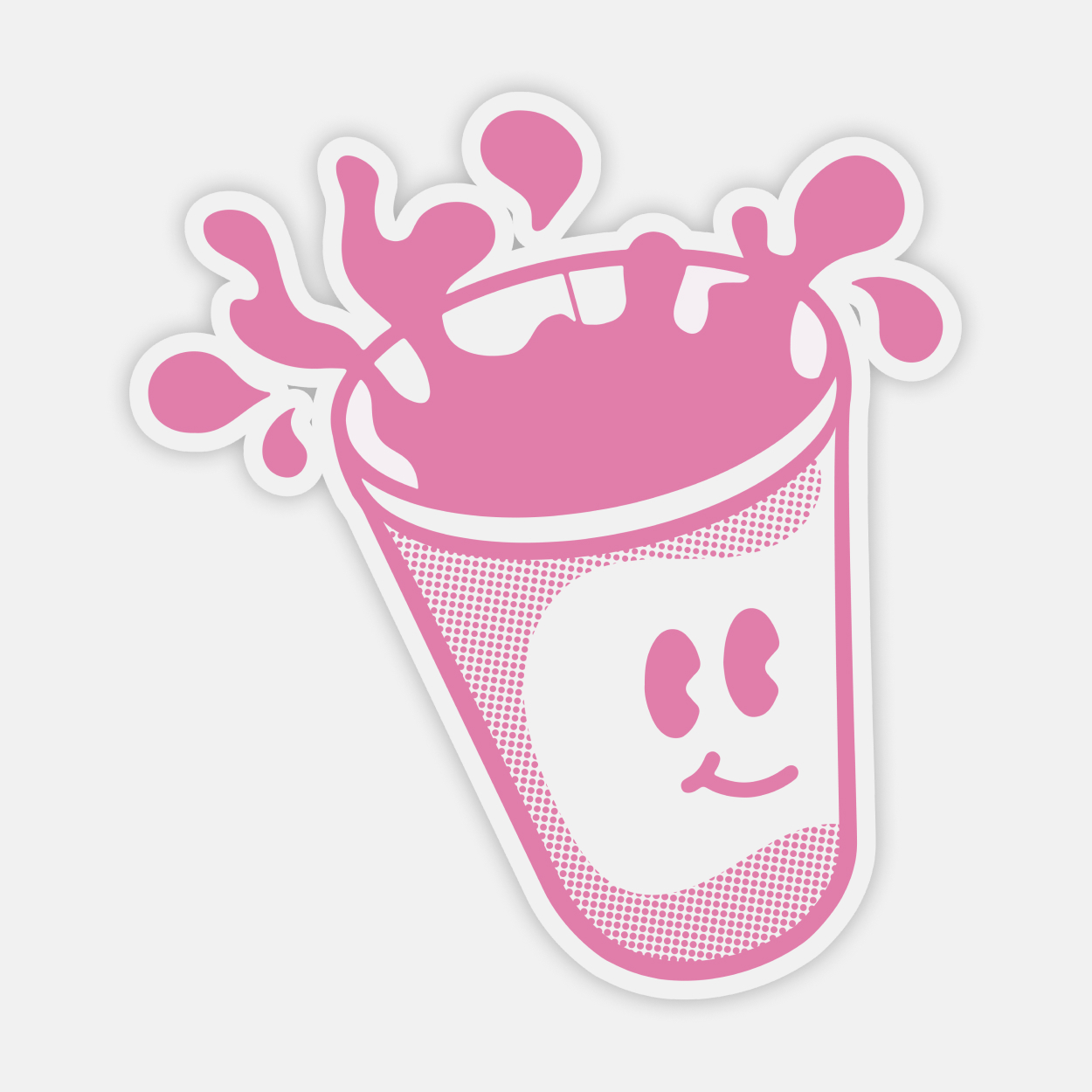
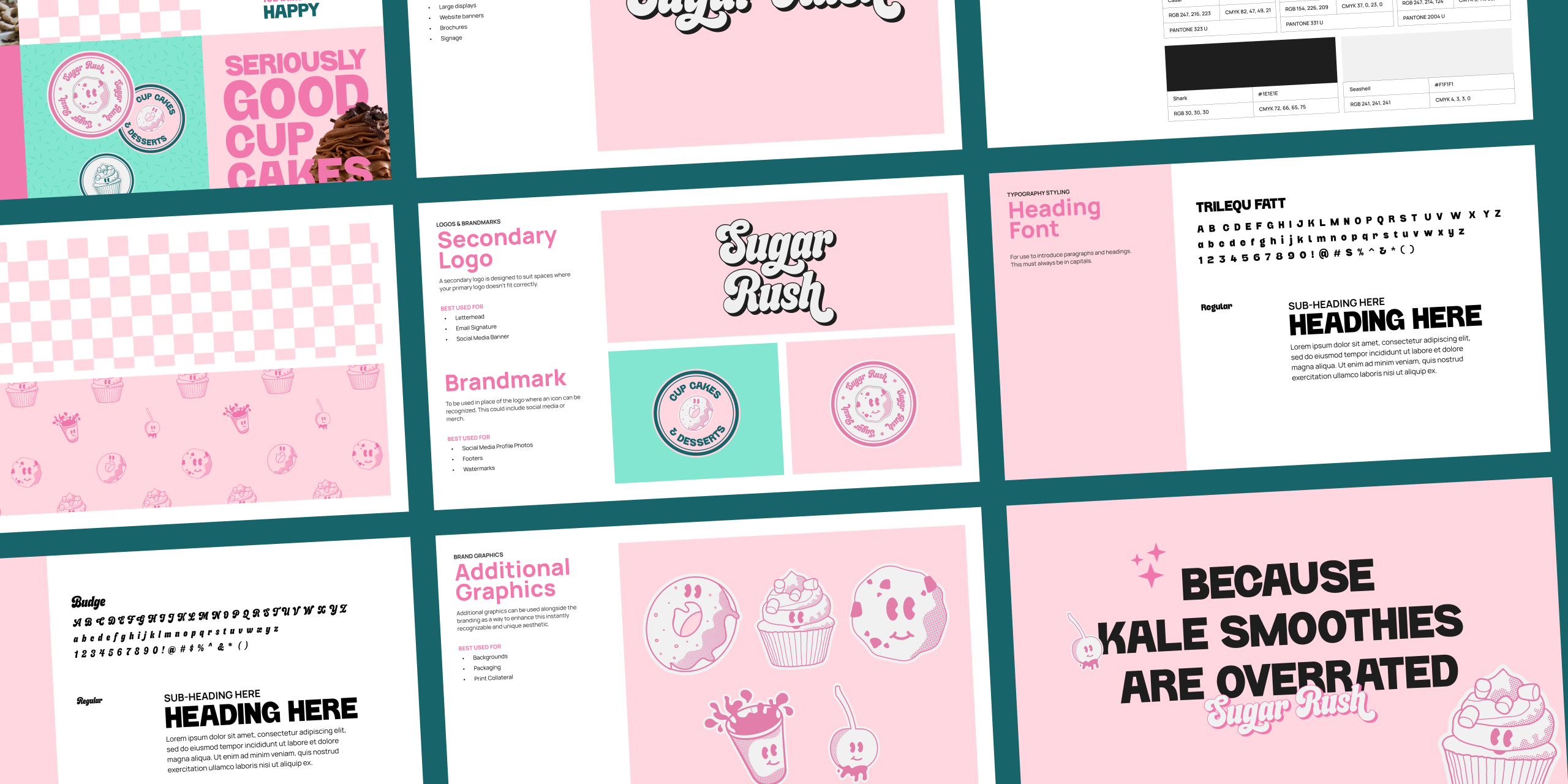
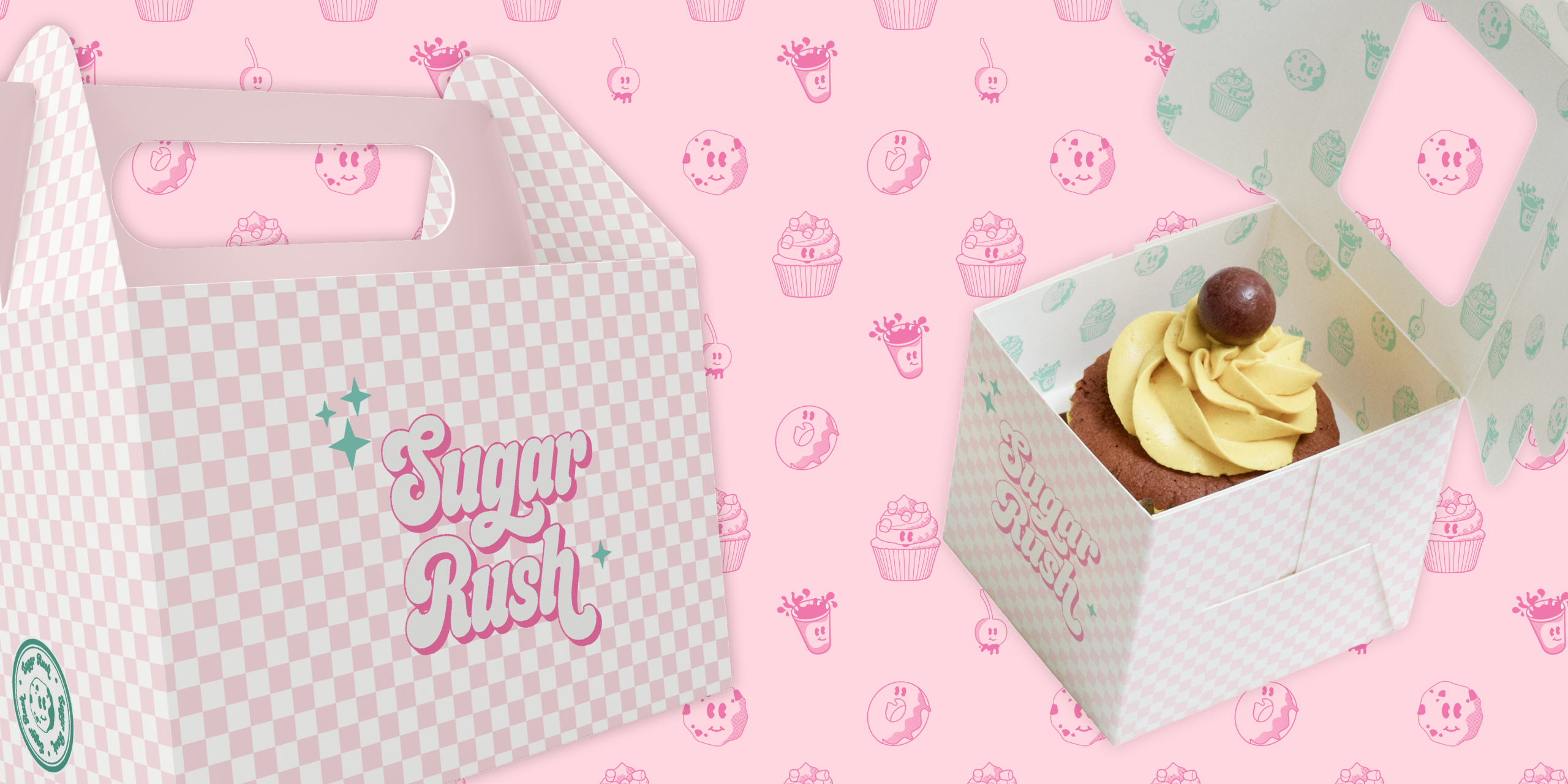
Hand-drawn character mascots over clean vector illustrations. A color palette pulled from the desserts themselves. Retro display typography that reads as playful without sacrificing legibility. A checkerboard pattern system that works across every touchpoint.
The goal: a brand that could carry the generational story Michelle was already telling, and make a first-time customer feel like a regular before they’d even walked in.
The Work


A Brand That Finally Matched the Business
Sugar Rush launched with a brand identity that finally matched the business behind it. I created a playful blend of hand-drawn elements, vibrant colors inspired by sprinkles and frosting, and quirky, retro-inspired fonts. My goal was to design a brand that instantly brightens moods and evokes cherished memories—sparking joy and a touch of sweet nostalgia with every glance. Sugar Rush’s new identity is a delightful trip down memory lane, encouraging customers to treat themselves to life’s little indulgences, one delectable dessert at a time.
“When I first reached out about rebranding Sugar Rush, I was nervous. Our bakery has been a staple for generations and I wanted to honor that legacy while bringing us into the modern age. I couldn’t be happier with the results! The new branding captures everything I love about our bakery—it’s fun, nostalgic, and makes you crave a cupcake just by looking at it. Since the rebrand, we’ve seen a surge in new customers and our regulars are head over heels for our fresh look. It’s like Steph reached into my dreams and pulled out the perfect visual representation of Sugar Rush. This rebrand has truly taken our little bakery to the next level!”
Michelle Kirkland
Want results like this?
More Work
READY TO BUILD A BRAND THAT DOES THE REAL WORK?
I take on a limited number of projects at a time so every client gets my full attention. If you're ready to stop blending in, let's talk.