
Brand Identity • Logo Design
birdie's
Client
Contact
Industry
Location
Year Completed
Affiliation

A Mission That Needed a Brand to Match
birdie’s is an ice cream truck founded by Camille Guimond in Prescott Valley, Arizona, built on a premise most dessert brands never touch: your purchase can do something. Every sale supports awareness and fundraising for children in foster care. The truck is the vehicle. The mission is the point. Camille built Birdie’s to give people an experience worth remembering, for a cause worth caring about. Ice cream truck, all grown up.

Why Nostalgia Had to Work Harder Than Pretty
Camille nearly bought a franchise. Pastel pink and blue, ice cream cone logo, the whole package. She walked away from it. That one decision told me more about where Birdie’s needed to go than any creative brief could.
The brand had two audiences to win at once: kids who want something fun and millennial moms who grew up in the 90s and respond to brands that feel like they remember the same things they do. A generic ice cream palette would lose both. Kids need visual energy. Millennial moms have seen every soft-serve color story there is. Neither group is moved by default.
The bigger challenge was the mission. Foster care awareness cannot be handled with a badge bolted onto an otherwise forgettable identity. After sitting across from enough business owners to know how this goes, the pattern is clear: a mission only carries weight if the brand around it looks like it means something. A cheap visual system undercuts the whole story.
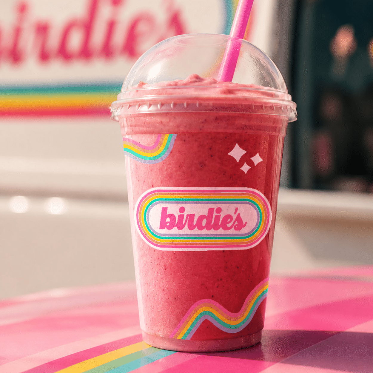
The answer was 90s nostalgia, executed with real care. Not a trend exercise. The honest visual language of the era birdie’s core audience grew up in. Bold, warm, unapologetically joyful. Lowercase cursive to stay approachable across age groups. A circular badge mark built to live on the side of a truck, scale down to a sticker, and hold its own on a social grid. Color pulled from the decade, not from the category default.
The goal: a brand that earns trust before the truck even stops.
A Brand Built to Carry the Story
The visual system lives on the truck, on packaging, on social, and on branded merch someone will actually want to wear. That last part was Camille’s bar. This clears it.
For a business where trust and purpose are the core differentiators, the brand had to signal both before a customer ever ordered. This one does.
The Identity




What Camille Said
birdie’s will launch with a mission that deservs a brand to match. The identity was delivered ahead of the truck’s public debut, giving Camille a visual system to grow into from day one.
Stephanie was an absolute pleasure to work with! She is so talented and took my vision and created a masterpiece. I cannot wait to work with her again on future design projects! 5 stars for Studiolit!
Camille Guimond
Want results like this?

More Work
Okay, what are we making?
I take on a limited number of projects at a time so every client gets my full attention. If you're ready to stop blending in, let's talk.