
From Fiverr Logo to Full Brand Identity: A Prescott Valley Brand Identity Case Study
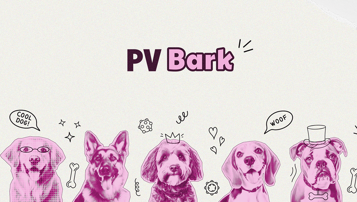
This Prescott Valley brand identity case study tells the story of how I took a Fiverr logo and turned it into a complete, launch-ready brand for PV Bark — Prescott Valley’s premier dog daycare, boarding, and grooming facility. When they came to Studiolit, they had a clear vision: to build a place designed to enrich the lives of dogs so they could bring more happiness to their humans. What they didn’t have was a brand.
And there’s a big difference between a logo and a brand.
The logo itself wasn’t bad, but it was a standalone graphic with no supporting system behind it — no defined color palette with proper specifications, no typography guidelines, no visual hierarchy, no strategy connecting how the business looked to how it should feel. It’s one of the most common situations I see with new businesses: you get a logo to check a box, and then quickly realize it’s not enough to build a cohesive presence across a website, signage, social media, print materials, and everything else a real business needs.
What followed was a full-scale brand identity buildout — taking that initial logo and expanding it into a complete brand system with a website, membership program, marketing collateral, email campaigns, and a social media strategy spanning over 160 planned posts. If you’re a local business owner who started with a logo and realized you need more — or if you’re about to launch and want to do it right the first time — this is for you.
Starting with Strategy, Not a Redesign
When a business comes to me with a Fiverr logo, the first instinct is usually “make it better.” But jumping straight into design refinements without understanding the strategy behind the brand is like repainting a house before checking the foundation.
With PV Bark, I started where every strong brand should start: with the brand strategy.
I worked through questions like who are the ideal customers (busy Prescott Valley pet parents who see their dogs as family), what makes this business different from other boarding and daycare options in the area (enrichment-based care, luxurious suites, a low-fragrance grooming salon), and what emotions the brand should evoke the moment someone encounters it.
Those answers shaped everything that came after. Every design decision, every word on the website, every piece of collateral — it all traced back to this strategic groundwork. The existing logo became one piece of a much larger puzzle rather than the starting point for the whole identity.
The Visual Identity: More Than a Logo
Once I had a clear strategic direction, I moved into the visual identity system. And I want to emphasize the word system here, because a brand identity is so much more than a logo file.
Logo Suite
For PV Bark, I developed a complete logo suite that included a primary logo, secondary logo variations, and a standalone brandmark. Each was delivered in every format a business could need: EPS, PNG, JPG, and PDF files in both print-ready (CMYK, high resolution) and digital (RGB, low resolution) versions. I also created full color, single color, black, and white variations of each — so no matter where the logo shows up, from a tiny social media avatar to a large-format sign on the building, it always looks intentional and clean.
Color Palette
The PV Bark color palette was designed to feel bold, trustworthy, and energetic. The deep royal blue communicates professionalism and reliability — qualities pet parents want in a place that’s caring for their dogs. The vibrant yellow brings warmth and energy that reflects the playful, joyful experience dogs have at the facility. Together, they create instant recognition and set PV Bark apart from the sea of generic pet business branding in the area.
Typography and Visual System
Beyond the logo and colors, I established typography guidelines, visual hierarchy rules, and design patterns that would carry through every touchpoint. This is the part of branding that most businesses skip — and it’s exactly why so many brands feel inconsistent across their website, social media, signage, and print materials. With PV Bark, I built the system so that everything would feel cohesive from day one.
Designing the Website
With the visual identity locked in, I moved into web design and development. The PV Bark website needed to do more than just look good — it needed to convert visitors into customers and support the business’s membership-based model.
I built the site on WordPress with a focus on clear navigation, mobile responsiveness, and conversion-focused design. Every page was structured to guide pet parents toward taking action, whether that was booking a tour, signing up for a membership, or joining the email list for pre-launch updates.
The website also needed to clearly communicate three distinct service lines — daycare, boarding, and grooming — without overwhelming visitors. I used the brand’s visual system to create clear differentiation between services while maintaining a cohesive experience throughout the site.
Building the PV Bark Club Membership Program
One of the most exciting parts of this project was developing the PV Bark Club, a tiered membership program designed to build long-term customer loyalty and predictable recurring revenue.
I designed three membership tiers — Bronze, Silver, and Gold — each with increasing benefits and perks. For their launch, I also created “Founding Member” designations to reward the pet parents who committed early and to create urgency around the opening.
The design work for the membership program was extensive. It included branded membership certificates for each tier (including all six variations: Founding Bronze, Founding Silver, Founding Gold, Bronze, Silver, and Gold), new member welcome pack concepts differentiated by tier, and marketing materials that clearly communicated the value proposition of each level.
The welcome packs were designed so that every new member feels genuinely valued, while Gold members get a VIP experience that reinforces their investment. I even built in subtle “upgrade nudges” for Bronze and Silver members — small inserts highlighting Gold-exclusive benefits to plant the seed for future tier upgrades.
Email Marketing: Staying Connected from Day One
PV Bark needed to build anticipation before they even opened. I designed a welcome email sequence that went out to everyone who signed up for their pre-launch mailing list. The emails were warm, personal, and on-brand — reflecting the same energy and care that pet parents would experience when they walked through the doors.
The email design carried through PV Bark’s full brand system: the blue and yellow palette, consistent typography, and a friendly tone that spoke directly to dog parents. I set these up in their email marketing platform with dynamic personalization, so each subscriber was greeted by name.
Social Media Strategy: 161 Posts, Zero Guesswork
Branding doesn’t stop at the logo and website. Some of the most important brand-building happens through the daily touchpoints — and for most local businesses, that means social media.
I developed a comprehensive social media marketing calendar for PV Bark spanning 161 individual posts across multiple content pillars: daycare highlights, wellness and health tips, grooming showcases, safety information, local community features, staff spotlights, training tips, behind-the-scenes content, client testimonials, and the recurring “Dog of the Week” series.
Every post was planned with specific caption prompts and content direction — not just “post something about grooming” but specific angles, hooks, and messaging that tied back to the brand strategy. The calendar was built so PV Bark’s team could execute it with confidence, knowing that every post reinforced the brand rather than diluting it.
Marketing Collateral: Bringing the Brand into the Physical Space
A pet care facility is a physical business, which means the brand has to work just as hard in the real world as it does online. I designed marketing collateral that extended PV Bark’s identity into every tangible touchpoint — from signage and brochures to the branded materials that members interact with every time they visit.
I also developed a complete customer appreciation strategy, including branded merchandise concepts (bandanas, treat bags, water bowls), gift ideas segmented by membership tier, and a VIP gifting program for their top-spending clients. These aren’t afterthoughts — they’re strategic brand extensions that turn everyday interactions into memorable brand experiences.
What Made This Project Work
Looking back at the full scope of this Prescott Valley brand identity project, a few things stand out about why it came together so well.
The brand launched before the doors opened. Building a brand identity before launch meant PV Bark didn’t have to undo bad first impressions or retrofit a professional identity onto an already-operating business. From their very first social media post to the day they opened, everything was cohesive.
Strategy drove every decision. I didn’t pick colors because they were trendy or choose fonts because they looked cool. Every visual and verbal choice was rooted in who PV Bark is, who they serve, and how they want their customers to feel. That’s the difference between decoration and design.
I built a system, not just assets. Individual design pieces — a logo here, a flyer there — don’t build a brand. A system does. PV Bark’s brand identity is a complete, interconnected toolkit that works across every medium, every format, and every customer interaction. That’s what gives them the ability to show up consistently as they grow.
I thought beyond the launch. The membership program, the social media calendar, the customer gifting strategy — these weren’t one-time deliverables. They were designed to drive ongoing engagement and revenue long after opening day. That kind of continuous design support is exactly what a monthly design retainer is built for. A brand that only works on launch day isn’t a brand. It’s a grand opening banner.
The Takeaway for Prescott Valley Business Owners
If you’re a Prescott Valley business owner — whether you’re about to launch or you’ve been operating for years — the PV Bark project illustrates something I see over and over again: investing in a complete brand identity upfront saves you time, money, and headaches down the road.
You don’t have to do everything at once. But you do need to start with strategy, build a system (not just a logo), and think about how your brand will show up across every touchpoint your customers encounter.
If any part of this case study sparked ideas for your own business, I’d love to talk about it. You can reach out to schedule a free consultation or download the Brand Glow-Up Audit to see where your current brand stands. And if you want to see more examples of the work, take a look at the portfolio.
Studiolit is a brand identity and web design studio based in Prescott Valley, Arizona, serving small businesses throughout the Prescott area with strategic branding, web design, and ongoing design support.

Stephanie Lauderback
Brand Identity Designer & Web Strategist
Stephanie is the founder of Studiolit, a solo branding and web design studio based in Prescott Valley, Arizona. With 15 years of experience working with small businesses on brand identity and web design, she helps founders stop blending in and start showing up as the obvious choice. She also teaches in the design program at Yavapai Community College.
Share this article: